I have been shooting seniors outdoors for 5 years now. Being on the shore of Lake Erie, I often am at the beach at sunset, shooting a portrait of the senior against a the setting sun and the lake. I'm getting pretty good at metering for natural light and color balancing for available light. But I still get a bit flummoxed at sunset. The light changes quickly and I need to be able to properly illuminate my subject in balance with the background.I've written about sunsets in the past, but I wanted to hit it again while the summer season is fresh. My technique revolves around exposing for a deeply saturated sunset, then providing adequate fill lighting for my subject. I'll set the ISO for 100 to drive a lower shutter speed, then take a sample shot of just the sky under Aperture priority and tweak the shutter speed to get under 1/250 second - the max sync speed of my attached flash.Then I review for exposure. Generally I'll underexpose the default sunset parameters by 1-2 stops. Say at ISO100 my exposure was 1/200 sec at f/4 under Aperture priority. Then I'll switch to Manual and set 1/200 and f/5.6 to f/8. That will darken the skies and saturate the colors.Here's where it gets tricky. Sometimes the sky is too bright even at ISO100 to give me a decent f-stop at 1/250. I often have trouble balancing the flash with the ambient light. So I tried a neutral density filter on the lens. That lets me set a lower f-stop / shutter speed combination.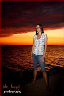 In this shot I had a Tiffen .9 Neutral Density filter on the lens. This gave me a lot of control over the shutter and f-stop combos in my flash speed range. Through trial and error, I set a flash compensation to give the right fill and shot away.At this point, the ND filter and camera settings give me great background exposures. I still have to tweak the flash settings a bit to get the right fill so the subject isn't washed out or underexposed. That's my next area of improvement.Overall I'm pretty happy with the set of exposures using the ND filter. I'll want to put some diffusion on my bare flash next time, to soften the shadows, but other than that I am happy.If anyone has tips to get good foreground/background balance for this kind of image, please let me know!
I have been in many offices and homes of co-workers, customers, friends and clients. I will often check out the family prints they have on display and will critique them for composition, lighting, editing and finishing. One thing that amazes me is the number of technically good photographs that look absolutely dull in the frame. The composition is fine, the lighting OK, but it's clear that the photographer didn't take much time editing and printing the images. The contrast is low, the exposure levels are not pleasing, and the color saturation is flat or the color temperature is wrong. And these are images that have come from "professional" studios.
It just looks to me like the photographer stopped working once the shutter was pressed.Image Editing WorkflowI believe that you need to touch each image to make it the best it can be. I have developed a workflow for editing images that I find to be efficient and provides good results. Here are the general steps I look at when editing a batch of photos. I apply this to virtually every image before my customer sees it, whether online or in proof/book form.- Is the exposure correct? (correct over or underexposure)
- Is the color balance correct? (It is now for me, as I set custom WB before shooting!)
- Are the skin tones pleasing? (if the image is nice but skin tones are dull, the subject will not "pop")
- Is the image contrast range wide and pleasing? (are darks dark enough, and lights light enough?)
- Is the color saturation appropriate? (are colors dull and faded, or bright and exciting?)
- Is the image cropped properly? (too much dead space?)
- Are there any quick cosmetic or environmental edits that I should make? (zits, distracting stuff in the BG, eye bags)
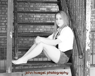
I don't actually go through this litany out loud, but my eye looks for things on the image that could become better with a bit of tweaking. It's the same thing that a film/negative photographer may have done after looking at contact sheets.ExampleThe first image of my daughter was taken during a scouting trip for outdoor locations for Seniors. This is a nice fire escape with good lines, color and texture. But to my eyes, it is flat. Part of that is because I overexposed the image a bit.My first step was to crop the image a bit. I took the default 4x6 layout and applied an 8x10 crop rectangle. This shortened the sides and increased the emphasis on the subject. This first image is after cropping, but with no other edits performed.IMAGE 1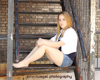
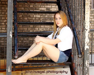
Next, I punched the contrast with the "Levels" tool, available in most any decent image editor. For me, I tend to pull the black point in past the tail of the black curve, then tweak the midpoint to bring the best exposure level to the skin tones. If I'm very underexposed, I may also bring in the white point. So here's image number two.IMAGE 2
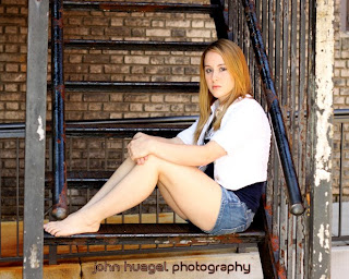
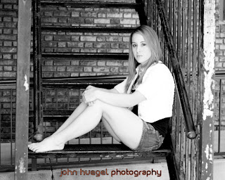
 Next, I brought the saturation up a bit. This you can overdo, so I watch for the point at which either skin tones or background elements look artificially colorful. Then I back off a bit. For most outdoor stuff, I'm applying maybe 8-15% saturation. In this image, the difference is very subtle. Look at the hair color and rust tones in the background.So before any special effects, here is the touched up image. With the hot keys I have in my editor (Paint Shop Pro X2), I can do this in about 30 seconds for each image, including the tweaking of settings between images.
IMAGE 3
 For black and white, the same is true. Here's the same cropped image converted to BW using Channel Mixer (red: 60%, green: 24% and blue: 16%). I prefer this mix because it tends to bring out skin tones. But you can see it's still "flat".
IMAGE 4
 So I go back to the Levels took and bring in the black point and nudge the midpoint. Now I like the overall balance better.
IMAGE 5
 ConclusionAmateurs don't often have the patience or skill to do these edits. The expect each shot out of their camera to be "good to go" and may be OK accepting drug store prints.When you sell prints to someone, they are in your hands for just a couple minutes, until you package and deliver them. But they are on display in someone's home or office for years. You can't let a boring, flat print represent you for the next 2 decades.You want your images to be exceptional, so that they will stand out from their amateur prints and those of other photographers who don't care enough to edit and print with care. You want the "wow" factor of your images to cause people to talk about the image and you. Spend the time with your images after you take them. Weed them down to the vital few, edit with care and taste, and make each image the best it can be. The impact on the customer will be significant, and your reputation as a true photographic artist will spread. Your killer prints will justify higher prices, and the word of mouth marketing will increase your business!
 Many photographers will at one time or another work indoors with backdrops and studio lighting. Over the years, photographers will build quite a collection of various backdrop materials, be it seamless paper or dyed or painted muslin or canvas.
My first backdrop was some white muslin I bought at Wal-Mart in the sewing section. My second backdrop was a grey backdrop I dyed myself from the same white Muslin. I quickly realized my talents did not lie in the backdrop production area, so I started buying them.
My favorite working backdrops came from Sky High Backgrounds (800-351-2158). They are heavy duty and very color saturated. I schlepped three of their backdrops home from the PPA show in San Antonio during the 2007 "Ice Storm" convention. I recently learned about Backgrounds by Cole (800-926-2653) here in Western PA and I have a flyer of theirs on my bulletin board. They may get my next order. I also use the heavy duty 10x20 white vinyl backdrop from Denny Manufacturing (800-844-5616) for much of my high key work, and their flat black for black background work. The black is also good to hang behind another backdrop if there is a bright light source behind the backdrop stand, such as a window.
I tend to prefer dyed muslin, as the colors are vibrant and the backdrops easy to move and set up. They do need some occasional steaming and cleaning, but they are portable to some degree. I take a couple of boxes of backdrops on location when I do my senior photography. The student picks a couple of colors and we hang the backdrops while they change clothing. We have done black, white/high key, red, blue, beige, camo and many more. I'm probably up to 10 backdrops in my "kit" by now.
Which leads me to this post. I have two 10'x20' painted muslin backdrops that I no longer use. One features shades of grey, called "Pearl and Grey", and the other shades of light blue and green, named "Mint and Blue". Think of the second one as a great set for "Little Mermaid", though many other colors will go well with it. I purchased these in 2007 from Owen's Originals (800-767-3122) for around $100 each. I'm selling them for $60 each plus shipping, or both for $100 plus shipping. They are in great shape, needing only to be steamed before use. First person to contact me gets them.
The photo of them folded up is actually a bit more abstract than functional, but I didn't have the space and time to unfurl them and give them proper illumination.
Contact me at 814-881-2840 or email johnhuegel@jhphotomusic.com if you are interested.


